Commissioned / Opdrachten 2010-heden

![]()
![]()
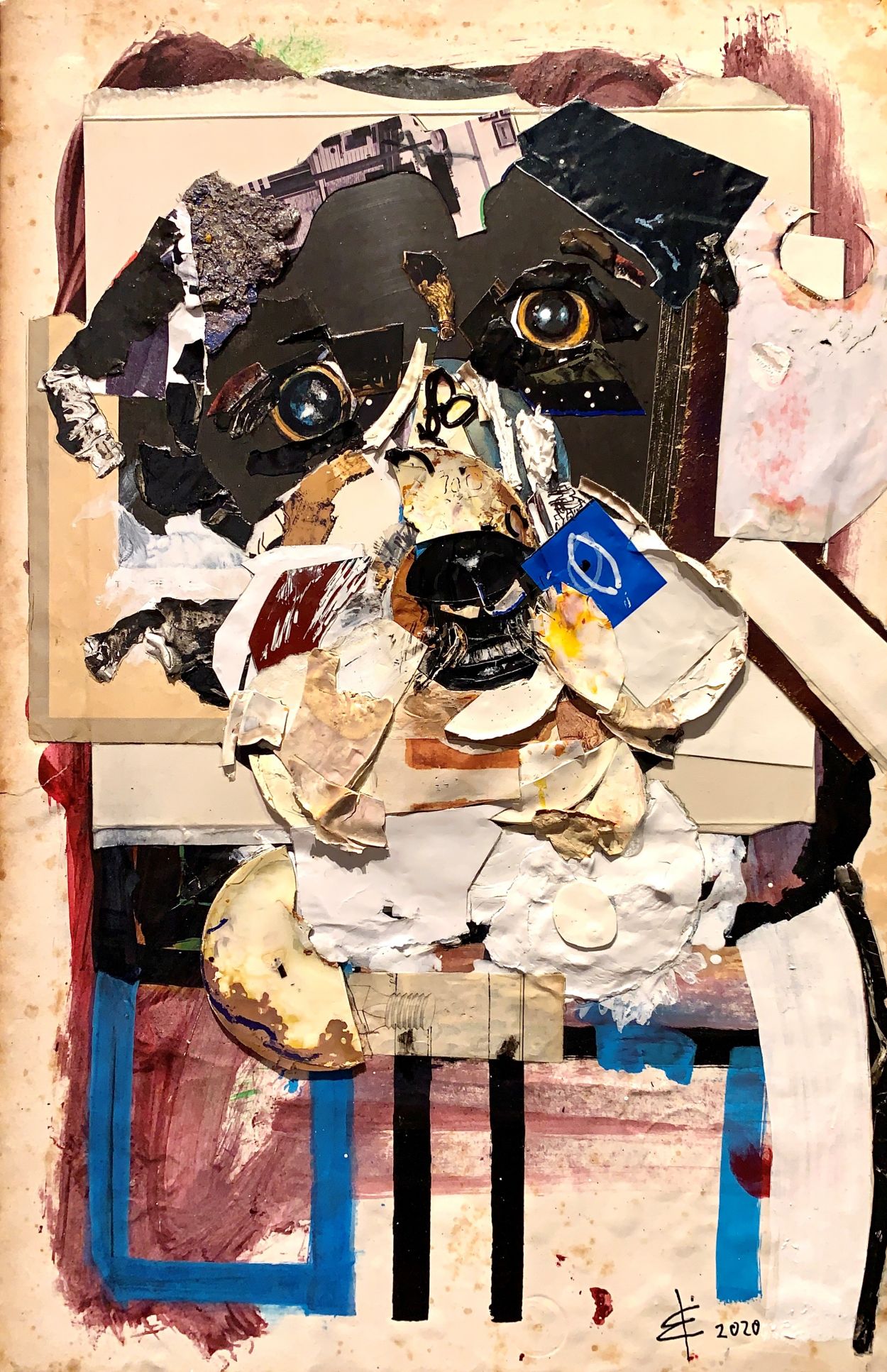
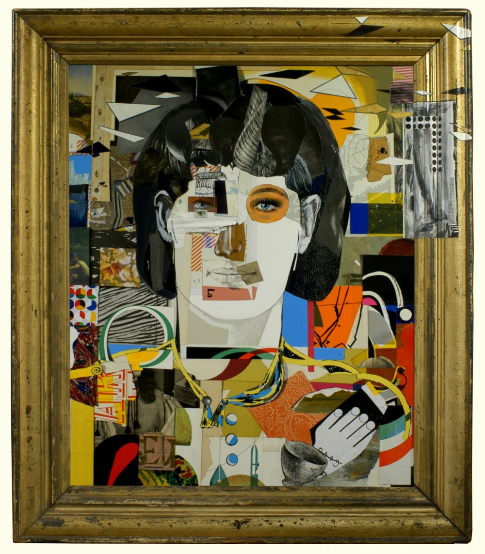
Mikey (2020)
Afmeting/Size 30 x 46½ cm, mixed media
Schilderproject zorgsector
“Tot de verbeelding spreken”
![]() Het werken met mensen met dementie is mij niet vreemd. Eerder heb ik op 28 locaties bij meerdere zorgcentra in het land projecten gerealiseerd. De projecten variëren van een plafondschildering met een doorsnee van 6 meter, de inrichting van grote vitrines met allerlei soorten werken tot een garderobe van “Delfts blauwe tegeltjes” beschilderd door bewoners. “Was getekend dementie….” is het boekje dat samen met een film over het allereerste project is uitgegeven in samenwerking met Marco Blom van Alzheimer Nederland.
Het werken met mensen met dementie is mij niet vreemd. Eerder heb ik op 28 locaties bij meerdere zorgcentra in het land projecten gerealiseerd. De projecten variëren van een plafondschildering met een doorsnee van 6 meter, de inrichting van grote vitrines met allerlei soorten werken tot een garderobe van “Delfts blauwe tegeltjes” beschilderd door bewoners. “Was getekend dementie….” is het boekje dat samen met een film over het allereerste project is uitgegeven in samenwerking met Marco Blom van Alzheimer Nederland.
Healthcare sector painting project
“Appealing to the Imagination”
![]() I am no stranger to working with people with dementia. I have already set up projects at 28 locations in a number of healthcare centres in the Netherlands. The projects vary from a ceiling painting with a diameter of 6 metres and big display cabinets filled with all kinds of works to a wardrobe of “Delft blue tiles” painted by residents. “Signed Dementia…” is the book published in conjunction with a film on the very first project, in collaboration with Marco Blom from Alzheimer Nederland.
I am no stranger to working with people with dementia. I have already set up projects at 28 locations in a number of healthcare centres in the Netherlands. The projects vary from a ceiling painting with a diameter of 6 metres and big display cabinets filled with all kinds of works to a wardrobe of “Delft blue tiles” painted by residents. “Signed Dementia…” is the book published in conjunction with a film on the very first project, in collaboration with Marco Blom from Alzheimer Nederland.
Commission piece / Opdracht
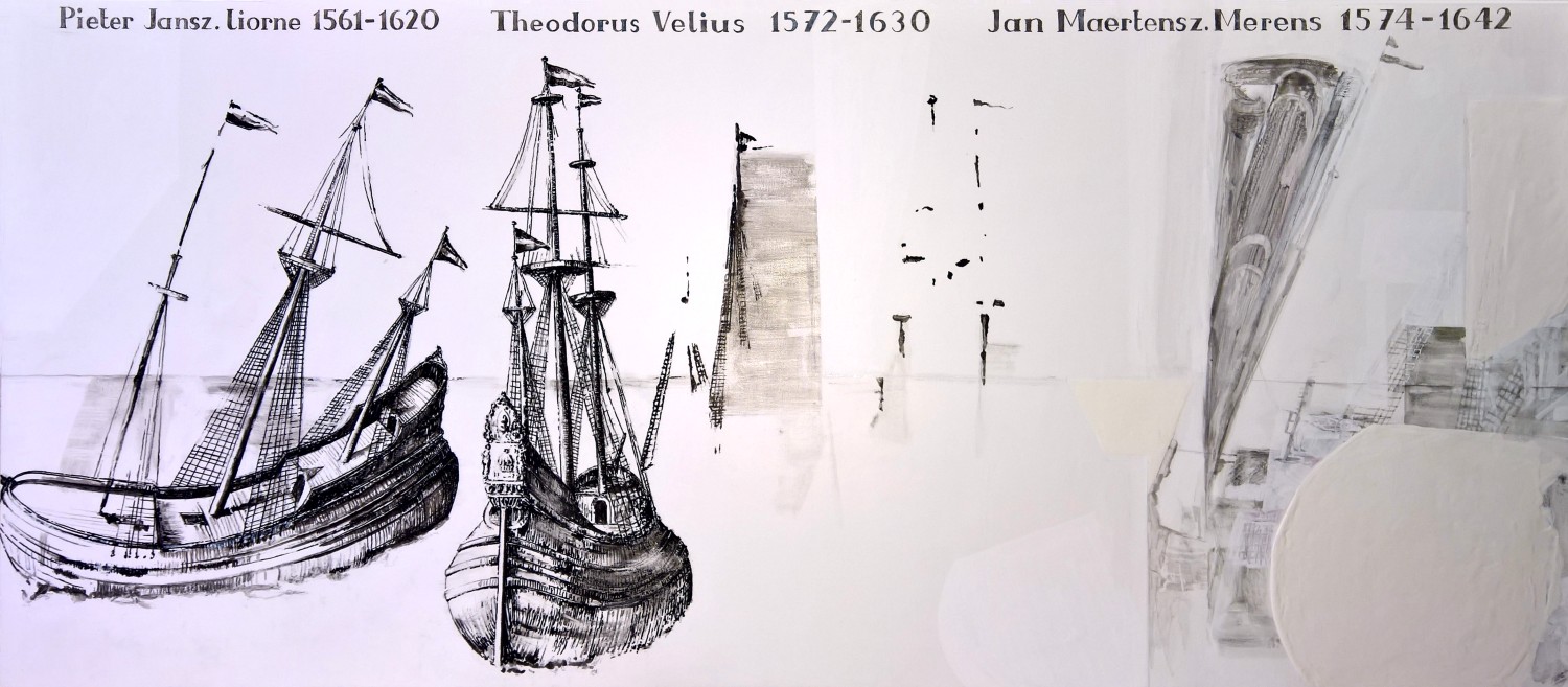
Fluytschip (2017)
- Opdracht voor in een zeilschip
- Assignment for in a sailing vessel
- Paneel 55 x 125 cm
- Panel 55 x 125 cm
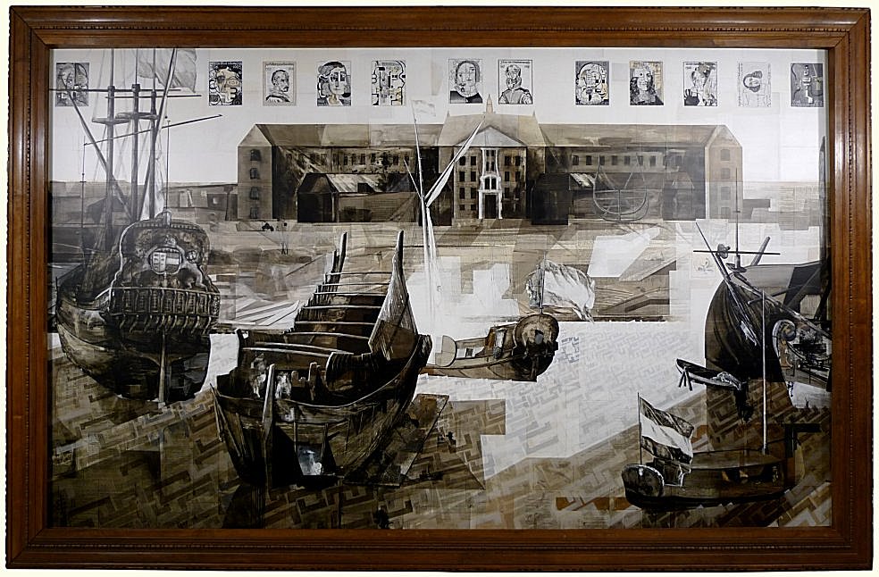
![]() Het Fluytschip of fluitschip (driemaster) heeft De Gouden Eeuw een enorme push gegeven. Het vrachtschip had weinig diepgang in het water, was stabiel, wendbaar en snel. Het aantal bemanningsleden dat nodig was om het schip te zeilen was laag, ongeveer 12.
Het Fluytschip of fluitschip (driemaster) heeft De Gouden Eeuw een enorme push gegeven. Het vrachtschip had weinig diepgang in het water, was stabiel, wendbaar en snel. Het aantal bemanningsleden dat nodig was om het schip te zeilen was laag, ongeveer 12.
De naam Pieter Janszoon Liorne (linksboven in het werk vermeld) is de koopman die in 1594 opdracht heeft gegeven voor het bouwen van dit tot dan toe onbekend scheepstype. Volgens overlevering heeft hij zich laten inspireren door de ark van Noah want hij heeft de verhoudingen van de specificaties van de ark zoals deze in de bijbel vermeld staan, toegepast.
Het schip had een smal dek en een groot buikig ruim. De hoogte van de tol (via de Sont naar de Oostzee) werd gemeten aan de grootte van het dek waardoor de fluit voordelig was bij de tolheffing. Deze wijze van tol berekenen bleef in gebruik tot 1669.
80 Fluitschepen werden in 8 jaar tijd in Hoorn gebouwd. Andere werven in ons land en later ook daarbuiten namen het idee over waarmee het Fluitschip het eerste in massaproductie gefabriceerde zeilschip wordt. Fluitschepen zwerven uit over alle wereldzeeën en worden een bekende verschijning. “Ze stralen de nuchterheid en degelijkheid uit van de Nederlandse koopman: robuust, eenvoudig, betrouwbaar en altijd uit op voordeel”.
De bouwkosten werden terugverdiend na één geslaagde reis waardoor het schip al na enkele reizen niet meer als rendabel gezien werd: het was goedkoper om een nieuw schip te bouwen dan het bestaande op te knappen. Dat gebeurde dan ook. Daarmee waren ze hun tijd ver vooruit als je de wegwerpmaatschappij van nu beziet.
De twee andere namen refereren aan twee goede vrienden en tijdgenoten van PIETER JANSZOON LIORNE (1561-1620) uit Hoorn. Hun namen duiken steeds op bij vermeldingen van het Fluytschip. Om die reden heb ik hun namen vermeld: THEODORUS VELIUS (1572-1630) en JAN MAERTENSZ. MERENS (1574-1642)
![]()
The fluyt (three master) gave an enormous boost to the Dutch Golden Age. The sailing vessel had a shallow draft and was stable, manoeuvrable and fast. Only a small number of approximately 12 crew members was needed to sail the ship.
The name Pieter Janszoon Liorne (upper left in the work) is the merchant who, in 1594, commissioned the building of this, until then, unknown type of ship. He is said to have been inspired by Noah’s Ark, as he used the ratios of the specifications for the ark given in the Bible.
The vessel had a narrow deck and a capacious hold. The level of the toll (along the Sound to the Baltic Sea) was measured in accordance with the size of the deck, which made the fluyt economical in terms of toll levies. This way of calculating tolls remained in use until 1669
80 fluyts were built in Hoorn in the space of 8 years. Other shipyards in the Netherlands and, later, in other countries adopted the idea, making the fluyt the first mass-produced sailing vessel. Fluyts sailed all over the world and became a familiar sight. “They exude the sobriety and solidness of the Dutch merchant: robust, simple, reliable and always on the lookout for a bargain”.
As the building costs were recouped with one successful voyage, after a few voyages the ship was no longer considered profitable: it was cheaper to build a new one than repair the existing vessel. So this is what happened. They were ahead of their time, if we look at today’s throwaway society.
The two other names refer to two good friends and contemporaries of PIETER JANSZOON LIORNE (1561-1620) from Hoorn. Their names constantly crop up in references to the fluyt. For that reason, I have stated their names: THEODORUS VELIUS (1572-1630) and JAN MAERTENSZ. MERENS (1574-1642)
Picture taken after the unveiling
Foto gemaakt na de onthulling
Commission piece / Opdracht
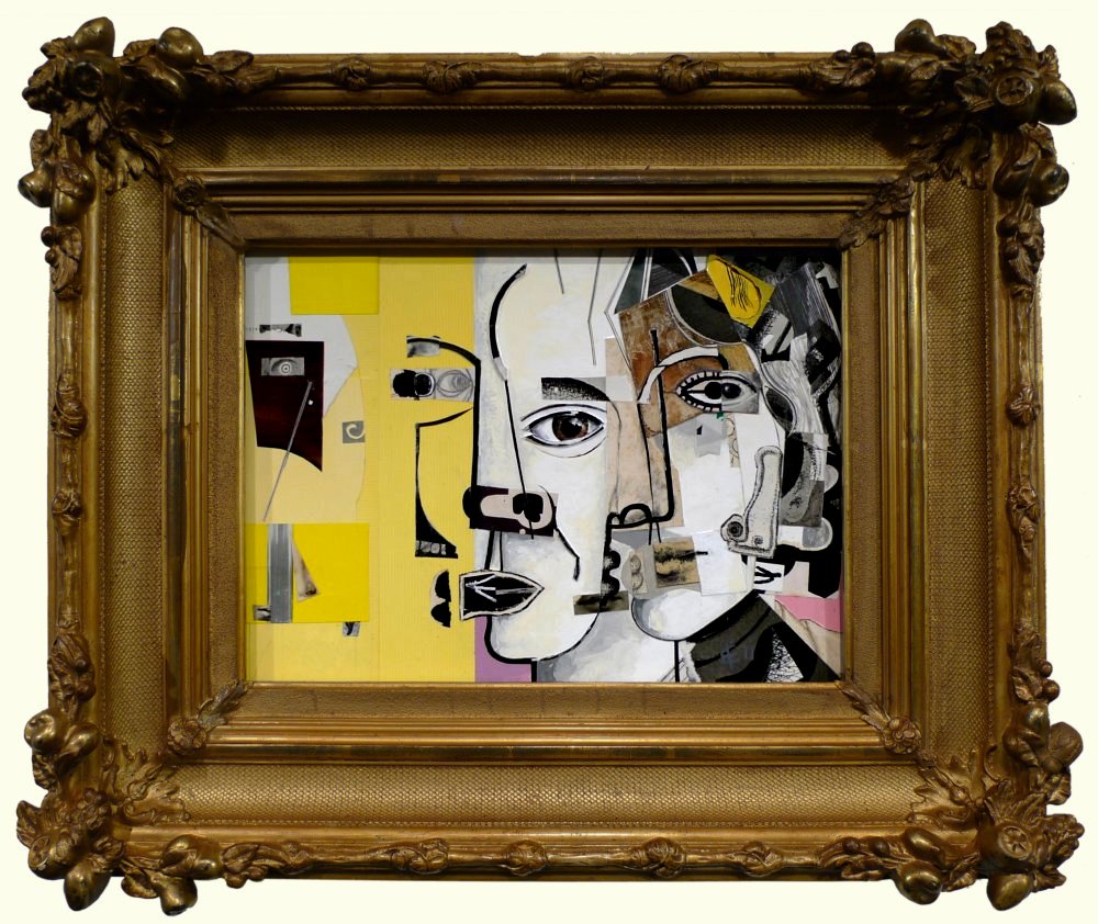
Marlin (2015)
- “Synthesis of personality and architecture”
“Synthese persoonlijkheid en architectuur”
- Frame approx 1860, size 63 x 75 cm
Lijst ±1860, afmeting 63 x 75 cm
![]() I feel that a portrait should not dilute reality; it must speak about who you meet.
I feel that a portrait should not dilute reality; it must speak about who you meet.
I’ve tried to capture her versatility, both professionally and personally, by using many different styles, such as Rococo, Futurism, Cubism, Renaissance, Avant-garde, Dada.
The portrait may appear chaotic at first, but its multiplicity calms the view. It all comes to a standstill, as if the pause button has been pressed. If you want, you can press the pause button again, and watch the movements, turning like a slow-motion film, showing all the depth.
The shape of the face is like a living room, where you can move the furniture around, and change the décor. From a realism point of view, my work method is aberrant. However, the observer is still able to create, in his mind, a living face from a portrait that is much more abstract than it appears. Her face, as well as her personality, is portrayed by elements that cannot, on the surface, be combined.
This is also expressed through her work: combinations of many elements that determine the final ‘feel’ of an interior, the feeling that it gives you. She represents the centre of her ideas, and the merger of her ideas with the architecture around her, which she translates into options.
![]() Een portret mag in mijn ogen geen verdunning van de werkelijkheid zijn en moet vertellen over wie je ontmoet.
Een portret mag in mijn ogen geen verdunning van de werkelijkheid zijn en moet vertellen over wie je ontmoet.
De veelzijdigheid van haar, zowel in haar werk als in haar persoonlijkheid, heb ik verwoord door gebruik te maken van een veelheid aan stijlen waar ik van hou waaronder Rococo, Futurisme, Kubisme, Renaissance, Avant-garde, Dada.
Mogelijk komt het portret in eerste instantie onrustig over, maar het is juist het veelzeggende dat rust geeft. Alles komt tot stilstand als een druk op een pauzeknop en als je wilt dan haal je deze van de pauze pauzestand af en zie je bewegingen als in een vertraagde film met de diepten die daarbij horen.
De indeling van het gezicht werkt voor mij als een huiskamer waar je meubels kunt verzetten en decors kunt veranderen. In de zin van realisme klopt er niets van mijn werkwijze en toch maakt de toeschouwer een levend gezicht van dit portret dat veel abstracter is dan dat het oogt. Zaken die ogenschijnlijk niet combineren vormen heel duidelijk het gezicht zo ook haar persoonlijkheid.
Dat zie ik ook in haar werkwijze: het zijn de combinaties van vele factoren die de uiteindelijke sfeer van een interieur bepalen en het gevoel dat je daarbij hebt. Zij verbeeldt het centrum van haar ideeënwereld en de samensmelting ervan met de architectuur binnen haar werk en overziet de mogelijkheden.
![]() Commission piece 2014
Commission piece 2014
The Three Church Fathers (2014)
- Gregory the Great (54 – 604) On the left
- Aurelius Augustinus (354 – 430) In the centre
- Jerome of Stridon (347 – 420) On the right
- Frame size 68 x 57 cm
![]() In opdracht gemaakt 2014
In opdracht gemaakt 2014
De drie Kerkvaders (2014)
- Gregorius de Grote (54 – 604) Links weergegeven
- Aurelius Augustinus (354 – 430) In het midden
- Hiëronymus van Stridon (347 – 420) Rechts weergegeven
- Lijst 68 x 57 cm
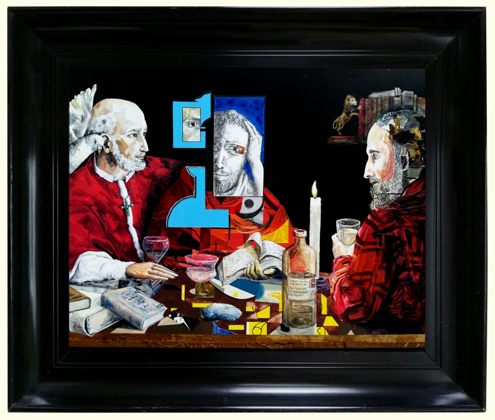
![]() The table where the church fathers are seated, tells the age of the wood.
The table where the church fathers are seated, tells the age of the wood.
The seating is very determining, it unites the past and present, and the observer can even perceive the imaginary predecessors that sat in their seats before them.
History is that which is present and that which is past. Everything goes towards the future, without knowing what lies ahead; anything might change the future. The past can be a great influence. That is why I use materials from the past in my painting.
- Part of the edge of the wooden table was created from a typographical book from 1925, another part dates back to ±1730.
- The book “When we were very young” was created from paper dating back to 1890.
- The label on the bottle was made from a piece of paper from 1800.
- Jerome’s hair and beard contain pieces of paper dating back to the 16th and 17th century.
- The book shelf and the books were created with pieces of paper from the 17th and 18th century.
Jerome of Stridon has his back turned to us for two reasons.
The way I placed him, opens up the piece.
Jerome was also very knowledgeable about many things; he was a scientist, philosopher and writer of letters and other works, and he was a very important translator. I wanted him situated across from his own works on the book shelf.
Jerome of Stridon and Aurelius Augustinus: to me, a layman as far as the Bible and religion are concerned, these two church fathers represent two very different worlds, but I also sense a lot of like-mindedness. Jerome of Stridon is linked to the foot of the tree, that penetrates life with its roots.
I’ve given Aurelius Augustinus some open shapes; in him, I observe the interest in spatial thoughts, the sky, the night, the heaven, both flowing and angular, rising like dew, falling like rain.
Gregory the Great distinguishes himself through his organisational talents and his human element, his gift of connecting people. He was also a great orator. In paintings, he is often portrayed with a dove at his right.
I wanted to show his connective gifts, and I used his right hand for that. This appears to just lie there on the table, but at the same time, it also appears to leave the table. The fingers are arranged next to each other, separate. The thumb holds the neck of the beer glass. Gregory is confident about his faith, and he exudes that. That is also my philosophy, even though I am only a layperson.
I was intrigued by the light, the light that falls onto the table, allowing the table to reflect the light onto the church fathers. In this case, the candle is only an apparition, not the true light.
![]() De tafel waaraan de kerkvaders hebben plaatsgenomen, vertelt de leeftijd van het hout.
De tafel waaraan de kerkvaders hebben plaatsgenomen, vertelt de leeftijd van het hout.
De zithouding bepaalt heel veel en brengt het verleden en het heden bij elkaar, zelfs de denkbeeldige voorgangers die op hun plek hebben gezeten, kun je waarnemen.
Geschiedenis is datgene dat aanwezig is en wat geweest is. Alles gaat de toekomst in maar kent deze nog niet, maar alles kan de toekomst veranderen. De invloed van het verleden kan groot zijn. Om die reden verwerk ik in het schilderij ook materiaal uit het verleden.
- Een deel van de houten tafelrand is uit een typografisch boek uit 1925 en een deel uit ± 1730.
- Het boek “When we were very young”, is gemaakt van papier uit 1890.
- Het etiket van de fles is van een stukje papier uit 1800.
- In het haar en in de baard van Hiëronymus heb ik stukjes papier verwerkt uit 1500 en 1600.
- In de boekenplank en de boeken zijn stukjes papier verwerkt uit 1600 en 1700.
Hiëronymus van Stridon heb ik met de rug naar ons toe zitten om twee redenen.
De manier waarop ik hem geplaatst heb, geeft het werk letterlijk ruimte.
Hiëronymus was ook een veelweter, een wetenschapper, filosoof en schrijver, ook van veel brieven, een belangrijk vertaler. Ik wilde hem ook tegenover zijn eigen werken plaatsen op de boekenplank.
Hiëronymus van Stridon en Aurelius Augustinus: voor mij als leek op het gebied van de Bijbel en het geloof, voel en lees ik bij deze twee kerkvaders zo uiteenlopende werelden, maar tegelijkertijd voel ik veel gelijkgezindheid.
Met Hiëronymus van Stridon associeer ik de voet van een boom die het leven met zijn wortels doorgrondt.
Ik heb Aurelius Augustinus openheid in vorm meegegeven en zie bij hem meer de interesse in ruimtelijke gedachten, de lucht, de nacht, de hemel, vloeiend en hoekig, ruimtelijk stijgend als condens en dalend als regen.
Gregorius de Grote onderscheidt zich door zijn organisatietalent en zijn menselijke vermogen om te binden. Hij was ook een groot spreker.
Overal vindt je op schilderijen dat hij begeleid wordt aan zijn rechterzijde door de duif.
Mijn behoefte om hem een verbindende uitstraling te geven zie je in zijn rechterhand. Deze ligt gewoon op de tafel en toch lijkt deze los te komen. Deze hand is keurig met de vingers langs elkaar en los. Met zijn duim heeft hij de hals van het bierglas vast. Gregorius draagt zijn geloof in alle rust en weet het over te brengen. Dit is mijn overtuiging ook al ben een ik leek.
Zelf ben ik geïntrigeerd door het licht, het licht dat op deze tafel gevallen is waardoor de tafel licht geeft aan de kerkvaders. De kaars is een verschijnsel in dit geval, niet het werkelijke licht.
![]()
Iris Murdoch 1919 – 1999
Commissioned 2011 / Opdracht 2011
Iris Murdoch 1919 – 1999 (2011)
- Frame c. 1870, dimensions 31 x 62 cm
- Lijst uit ±1870, afmeting 31 x 50 cm
![]()
![]() Iris Murdoch was an author and philosopher. She is highly respected in Irish and English literature. She dissected her characters to the bare bone. The situations are grotesque and follow each other rapidly, writing above the ‘reality at first glance’.
Iris Murdoch was an author and philosopher. She is highly respected in Irish and English literature. She dissected her characters to the bare bone. The situations are grotesque and follow each other rapidly, writing above the ‘reality at first glance’.
She dedicated her novel ‘Under the net’, written in 1954, to the French author Raymond Queneau, the founder of the OULIPO (Ouvroir de Littérature Potentielle). A man she admired, who meant a lot to her and proved influential to her.
“The most essential and fundamental aspect of culture is the study of literature, since this is an education in how to picture and understand human situations.”
“The good does not so much come from ourselves, but we need images that offer us the good, time and again and each time different.”
Anybody wishing to learn more about Murdoch’s philosophy can start with “On ‘God’ and ‘Good’”.
In the painting, I have depicted Iris from young (right) to old (left).
The section with the yellow background illustrates the last stage of her life in which she suffered from dementia, during which Iris disappeared from our reality and entered into a realism that was new for her.
I have incorporated Raymond Queneau in profile in her face.
![]()
![]() Iris Murdoch was schrijfster en filosofe. Ze is een begrip in de Ierse en Engelse literatuur. Zij ontleedt haar personages tot op het bot. De situaties zijn grotesk en volgen elkaar snel op. Boven de ‘werkelijkheid op het eerste gezicht’ uit schrijvend.
Iris Murdoch was schrijfster en filosofe. Ze is een begrip in de Ierse en Engelse literatuur. Zij ontleedt haar personages tot op het bot. De situaties zijn grotesk en volgen elkaar snel op. Boven de ‘werkelijkheid op het eerste gezicht’ uit schrijvend.
Haar roman ‘Under the net’ uit 1954 heeft zij opgedragen aan de Franse schrijver Raymond Queneau, de oprichter van de OULIPO (Ouvroir de Littérature Potentielle). Een man die zij bewonderde, veel voor haar betekende en van invloed op haar is geweest.
“Het meest wezenlijke en fundamentele aspect van de cultuur is de studie van literatuur, omdat deze ons leert hoe we ons menselijke situaties moeten voorstellen”.
“Het goede komt niet zozeer uit onszelf, maar we hebben beelden nodig die ons het goede aanreiken, telkens weer en telkens anders”. Wie Murdochs filosofie wil leren kennen, kan met ‘Over God en het Goede beginnen’.
In het schilderij heb ik Iris van jong (rechts) naar oud (links) weergegeven. Het gedeelte met de gele ondergrond verbeeldt de laatste fase van haar leven waarin zij aan dementie leed, waarin Iris verdwijnt uit onze realiteit en terecht komt in een voor haar nieuw realisme. Raymond Queneau heb ik en profil verwerkt in haar gezicht.
![]()
 De Gouden Eeuw (2011)
 The Golden Age (2011)